
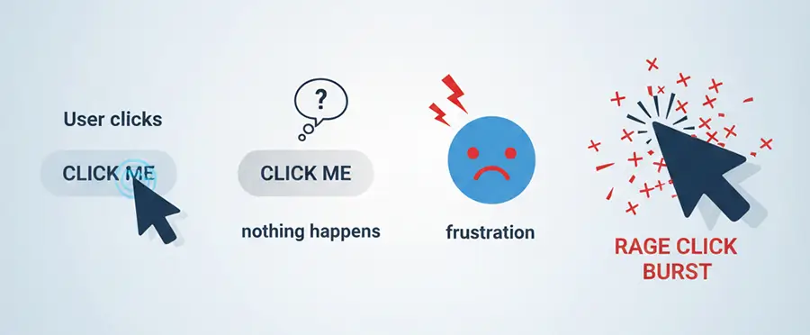
Have you ever landed on a website or opened an app, tried to click or tap a button, and nothing happened? How did that feel?
Most people try two or three times again, thinking it might have been just a small glitch. When it still does not work, the outcome is usually the same: frustration, leaving the site, or simply closing the app.
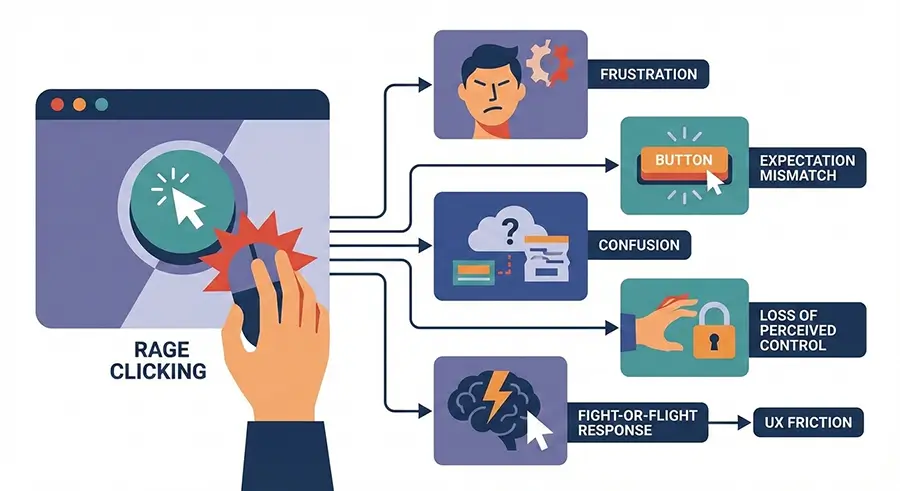
Put simply, rage clicks or rage tapping are some of the clearest signals of a broken user experience. They are a serious warning that something in your UX design needs attention.
My name is Melina, and in this article, I will walk you through how to spot rage clicks and fix them as quickly as possible.
What Are Rage Clicks?
A rage click happens when a user clicks on an element in a website or app, and nothing happens, then repeats the same action two or three times in quick succession. This usually happens within a short window of around 100 to 2000 milliseconds.
Why call it a rage click? Because when users feel confused or irritated, they naturally start clicking the same button again and again, almost without thinking.
You may see this behavior described under different names, such as rage clicks, frustration clicks, click rage, rage tapping, rapid clicks, or even angry clicks.
Behavioral Meaning
From a psychological and behavioral point of view, users tend to feel mental tension while using a website or app when one or more of the following occur:
- Their time feels wasted
- They are forced to wait longer than they expected
- They fail to reach their intended goal
In these moments, users start clicking the same element repeatedly, which triggers a rage-click event.
Technical Meaning
From a technical and analytical standpoint, rage clicks occur when an event executes slowly, fails to execute, or returns a response that does not match the user’s expectations. Simply put, the app or web page does not react in a way that feels responsive or helpful.
In tools that support rage-click analytics, each rage-click event is typically captured and recorded as a separate interaction.
The UX Impact of Rage Clicks
Rage clicks are a “red-flag” warning. They show that the user is highly confused and frustrated, and often just one step away from leaving the website or app completely.
Rage clicks can lead to serious, sometimes costly consequences, including lower conversion rates, weaker retention, damage to brand awareness, and higher support costs.
They additionally affect how users behave across the rest of the product. Once frustration kicks in, it affects how people interact with other sections and features, too.
Key impacts include:
- A noticeable drop-off in conversion rates and overall revenue
- Negative effects on user experience and satisfaction, commonly causing poor reviews
- Long-term damage to user loyalty, retention, and overall brand perception
Rage Click vs Dead Click vs Error Click vs Thrash Click
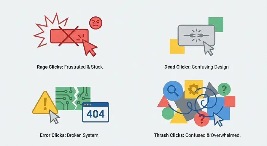
All of these terms are used as signals of user frustration in behavioral analytics. That said, they are not quite the same thing. Each one points to a slightly different issue from a behavioral and UX perspective. The key differences are outlined below.
| Term | Core Definition | Common Cause | Primary UX Impact |
| Rage Click | Multiple consecutive clicks, usually more than three, on the same element within 1 to 2 seconds, without meeting the user’s expectation | Slow response times, inactive buttons, misleading UI, long loading states | Intense frustration, higher bounce rates, page abandonment |
| Dead Click | A single click or tap on an element that produces no reaction at all, almost as if the button does not exist | Broken links, disabled buttons, broken images | Loss of trust, user confusion, wasted waiting time |
| Error Click | A click that triggers a JavaScript error in the browser console or visibly throws a technical error to the user | Technical bugs, server response failures, missing or broken URLs | Loss of trust, user anxiety after seeing unfamiliar or alarming error messages |
| Thrash Click / Thrashed Cursor | Aimless mouse movement while trying to reach a goal but failing to find it, essentially the user wandering around the page | Poor navigation, flawed UI design | Lower engagement, higher churn, users getting lost on the page |
It’s easy to group all these angry-looking clicks together in analytics tools, but this can mislead you Based on data analysis conducted at Skippership, we noticed the following patterns:
- 63% of users who experienced rage clicks abandoned the website or app
- 48% of users who encountered error clicks abandoned their next step
- 33% of users who experienced dead clicks typically dropped off
- 11% of users who encountered thrash clicks or a thrashed cursor abandoned the page
These numbers make one thing clear: not all frustration signals are equal, but every single one of them deserves serious attention.
Why Do Rage Clicks Happen?
Now that we know what rage clicks are and why they’re a key metric for understanding user behavior, the next step is to dig into the root causes and figure out how to fix them.
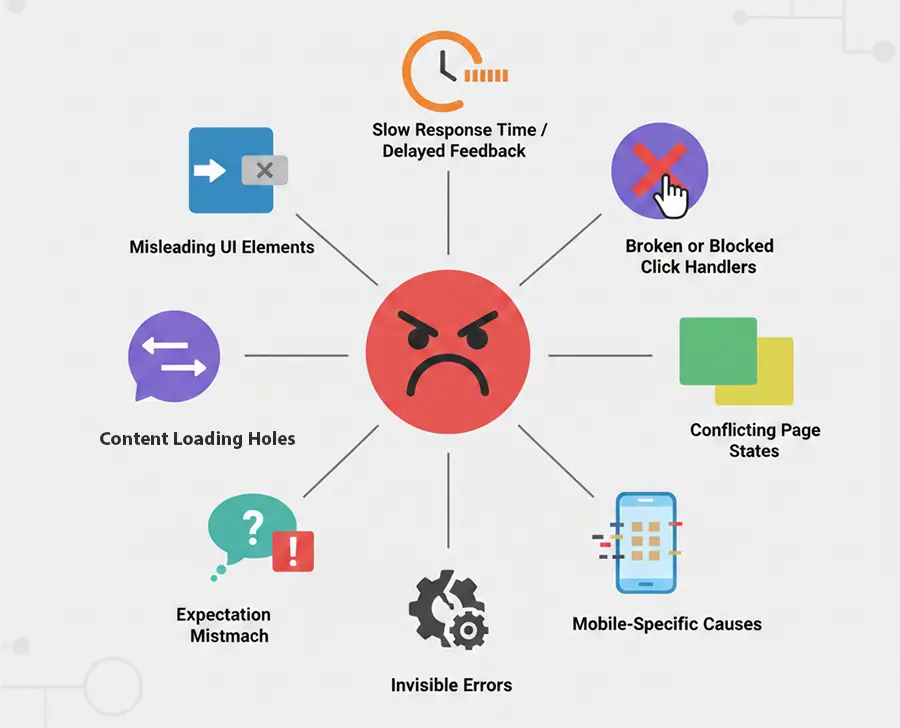
There are generally eight common reasons rage clicks happen. Let’s start with the first one.
1. Misleading UI Elements
The biggest reason behind rage clicks is misleading UI elements. This happens when a user assumes—just from the way a button or element looks—that it should be clickable, but when they click, nothing happens.
You usually see this in situations like:
- Underlined text that looks like a link but isn’t actually clickable
- Images inside content or layouts that are styled like buttons but don’t respond
- Icons that show hover effects but don’t trigger any action when clicked
- Decorative elements that look interactive but are purely visual and don’t do anything
Users see something that looks actionable, try to click it, and get frustrated when it doesn’t respond—classic rage click territory.
2. Slow Response Time / Slow Response
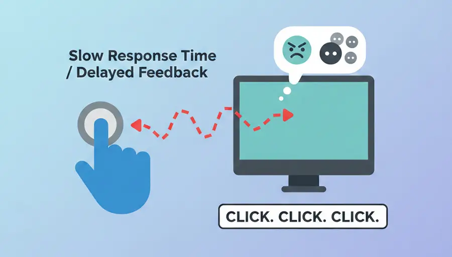
We all expect that when we click a button or element, it should respond almost instantly—usually in under 250 milliseconds. When that response drags on without any visual feedback—like a spinner or loading bar—users often assume their first click didn’t register. So they click again, maybe a few times, which ends up causing a rage click. Basically, if users don’t know something is loading, they start thinking the feature is broken.
3. Broken or Blocked Click Handlers
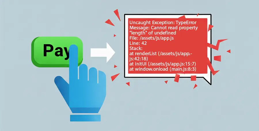
Another frequent culprit is elements, buttons, or links that don’t work correctly because of JavaScript issues. For example, clicking a submit button might suddenly trigger a random JavaScript error or pop up a modal showing a red error code. Technically speaking, the event handlers on that element, button, or link aren’t working as they should.
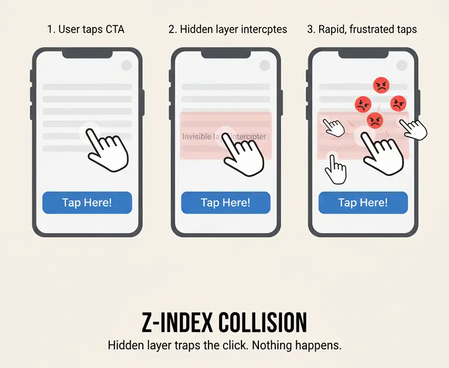
A similar problem happens when elements overlap. For instance, clicking a button might open a modal that blocks the button underneath, making it unclickable. This usually happens because of poor layer management in the layout, often caused by z-index misconfiguration.
4. Conflicting Page States
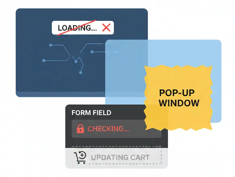
This happens when a user takes an action, like clicking a Checkout button, and the site or app is moving them to the payment page, but there’s no spinner, progress bar, or message to show that anything is happening. Sometimes, when a user fills out a form and clicks Submit or Apply, the button becomes disabled, but no feedback indicates what’s happening.
In short, it’s all about not giving the user clear messages or proper loading indicators while an action is in progress.
5. Expectation Mismatch
User expectations matter, and ignoring them can create frustration. Expectation mismatches occur when a user clicks a button or element expecting one result, but something else happens because of poor design.
A couple of examples:
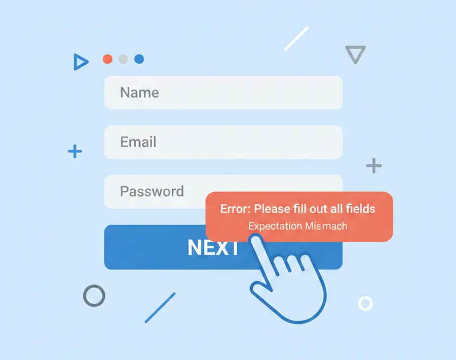
- In a multi-step or wizard form, a user clicks “Next” expecting to move to the next step, but a validation error suddenly pops up. Here, the user’s mental model doesn’t match the platform’s logic.
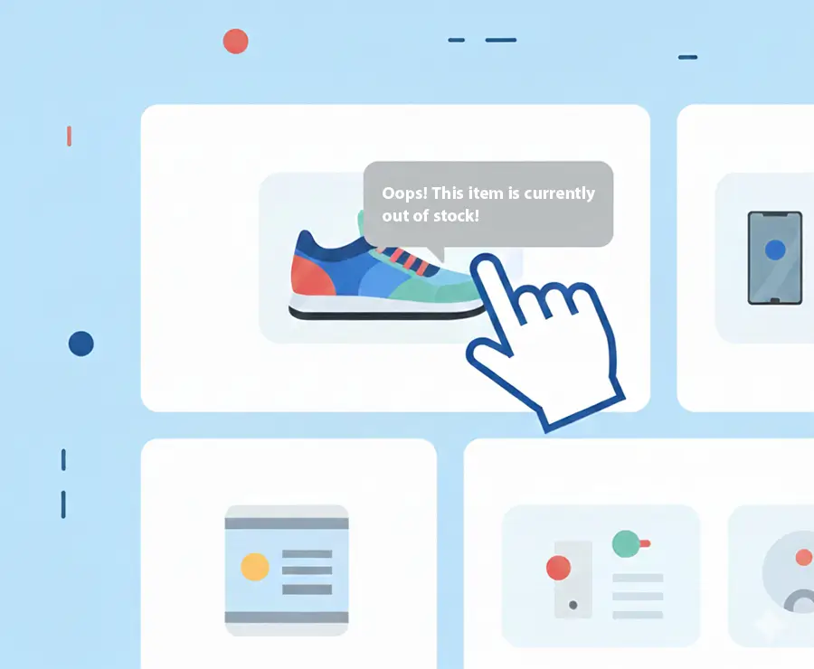
- Clicking a product image might only display a tooltip rather than taking the user to the product details page. In this case, the expected behavior doesn’t match what actually happens, since users generally expect a product image click to open the full page.
6. Invisible Errors
As the name suggests, invisible errors are issues users can’t see and don’t get any feedback about, which often leads to click frustration. Examples include:
- Form errors that don’t appear next to the relevant field, causing users to leave unsure which input caused the problem
- Error messages are in colors that are hard to notice, so users don’t understand why they can’t submit the form
- Disabled buttons with no explanation
- JavaScript errors running in the background that users have no way of knowing about
7. Mobile-Specific Causes
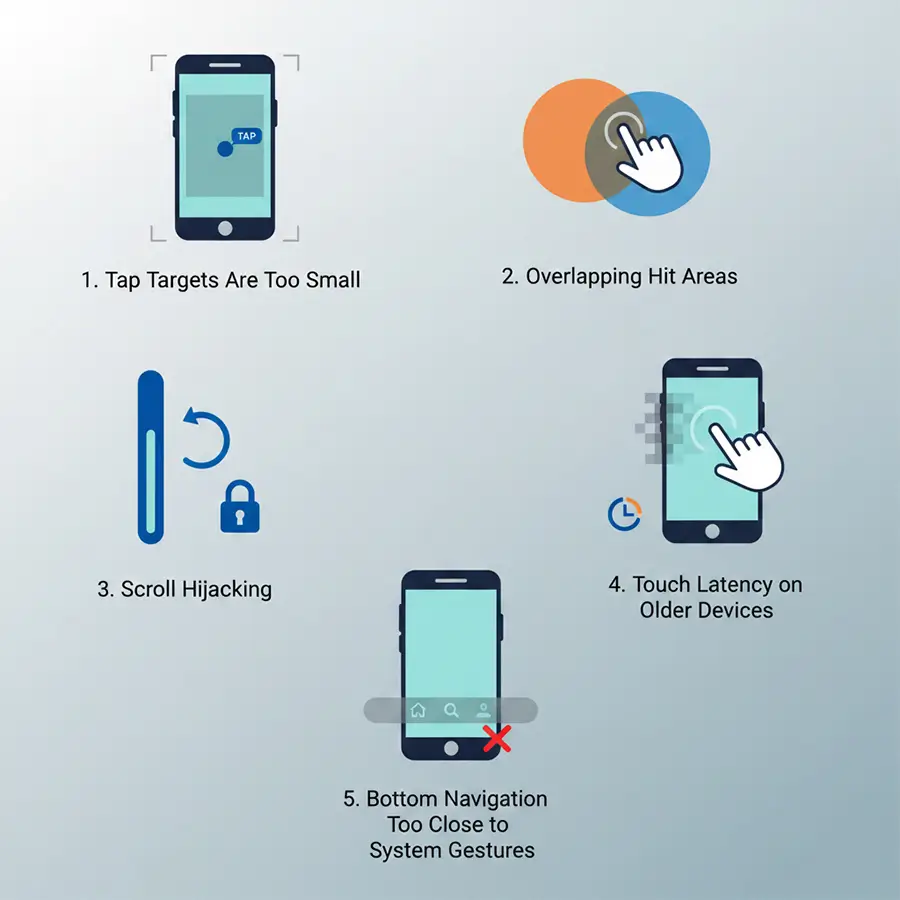
When looking at mobile users, rage-tapping is common. This happens when users repeatedly tap on something they expect to work, but it doesn’t respond. Some common causes:
1. Tap Targets Are Too Small
Tap areas smaller than the recommended 44–48 pixels are hard to hit. No matter how many times users tap, nothing happens, and rage tapping starts.
2. Overlapping Hit Areas
Two buttons overlapping due to poor design can leave users unsure which one they’re actually activating, creating more frustration.
3. Scroll Hijacking
Sometimes a user taps a button or element, but the page scrolls instead of triggering the action. Users think their tap didn’t register, so they tap repeatedly.
4. Touch Latency on Older Devices
Not all users have the latest devices. If an action or button demands more CPU or memory than an older device can handle, the response is delayed, prompting repeated taps.
5. Bottom Navigation Too Close to System Gestures
Most mobile devices have navigation menus at the bottom. If your app’s buttons sit too close to these system gestures, users may struggle to tap them accurately.
The problem: On many phones, default actions like swiping up to go home are located at the bottom. If your app’s main navigation buttons are too close, users run into trouble. So, the user tries to tap a button, but instead of the app responding, the system bar or phone menu appears. They try again, hoping it will work, but each failed attempt makes them more frustrated.
8. Content Loading Holes
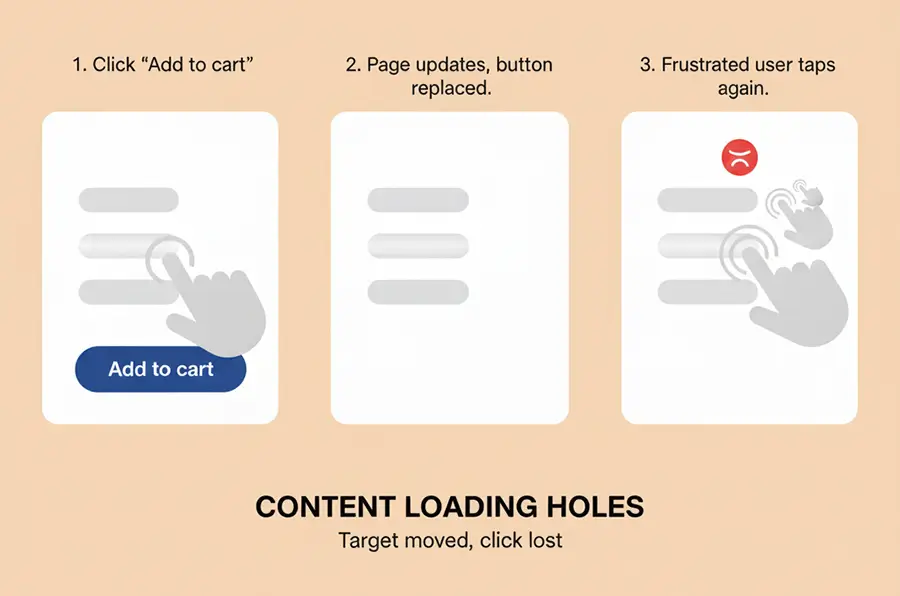
A common example: a user taps “Add to Cart,” and the screen fills with gray placeholders or animated loading blocks. The button becomes unresponsive, and the user has no way to know whether the product was added or if loading has finished. Frequently, uncertainty leads to rapid rage tapping.
Real Examples of Rage Clicks
All the concepts we’ve covered so far actually show up in the real world. Here are five real examples we’ve seen at Skippership.
Example 1: The Submit Button on a Form Doesn’t Work
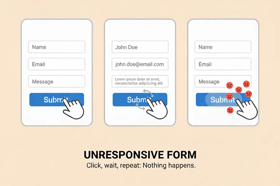
Scenario: During the latest update for one of our clients, a new contact form was added to their Contact Us page. After reaching our support team, the client asked for a way to monitor that page exclusively for analysis.
When our customer support team reviewed their analytics, we noticed a clear user reaction: clicking the Submit button did nothing. As soon as we ran our first test and dug into the session replays for rage clicks, it quickly became clear that rage clicks on the Contact Us page had spiked unexpectedly.
Root Cause: After reviewing multiple session replays, we determined that the button was not functioning for any users. Requests were being sent to the API or server, but users weren’t notified that their message had been received. That lack of feedback caused users to submit multiple requests in rapid succession.
Improvement: After a user submitted the form, the Submit button and loading indicator became active and stayed disabled until the server responded. A success message was added to provide users with a clear visual confirmation that their submission was successful.
Example 2: Product Images Were Not Properly Linked
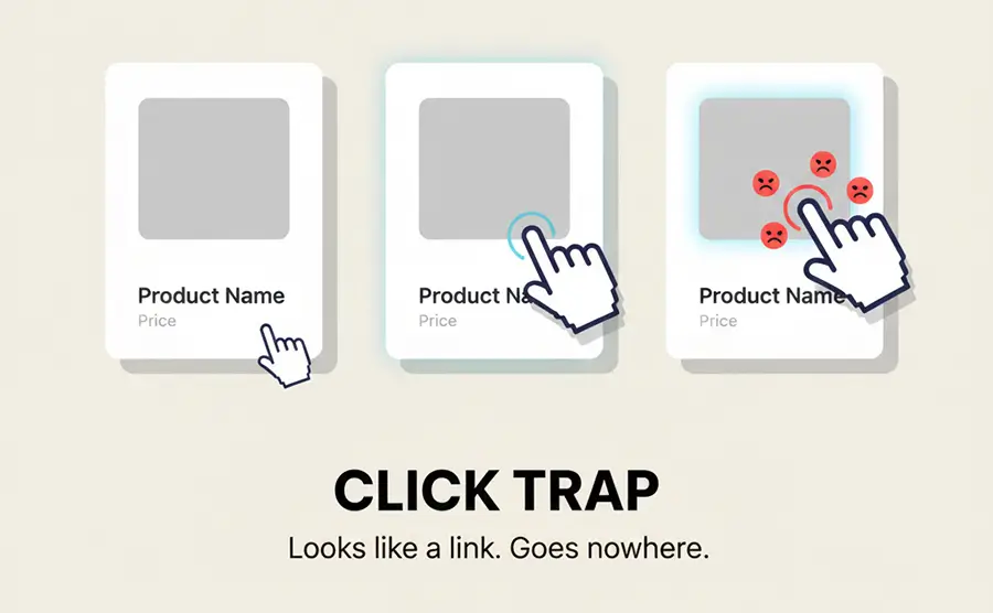
We mentioned this briefly before, but let’s delve a little more.
Scenario: On an e-commerce or content site, when you see a list of products or posts, you naturally expect that clicking anywhere on a product or post box will take you to the details page or a read more section.
On the e-commerce site we reviewed, the product listing page (PLP) had a surprisingly high number of rage clicks. Watching session replay videos, it became clear that users expected clicking a product image to take them to the product details page (PDP).
Root Cause: Users bring a natural grasp of e-commerce platforms with them—clicking a product image typically takes them to the details page. Here, the cursor changed to a hand icon and the image had a hover shadow, but clicking did nothing, breaking that expectation.
Improvement: Linking the entire product box to the product details page fixed the issue and put an end to the rage clicks.
Example 3: Dropdown Menu Closing Too Quickly
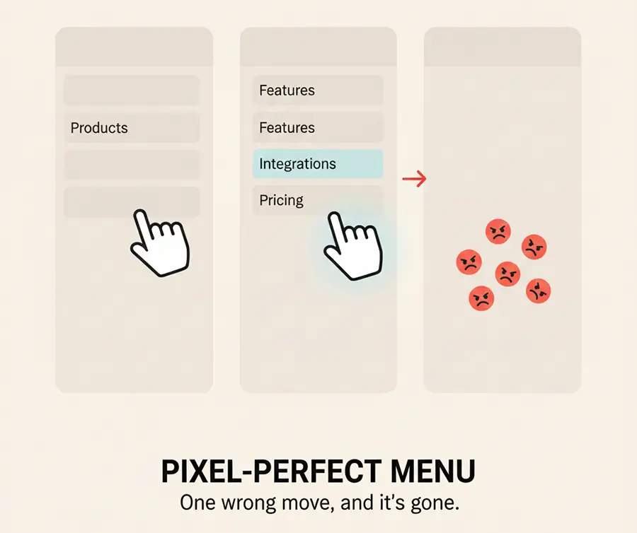
Scenario: One of our clients, a SaaS provider, reached out asking why traffic to their Integrations page had dropped. Looking at session replay videos, we noticed users repeatedly rage-clicking whenever they tried to navigate from the Product menu to the Integrations page.
Root Cause: The menu had been recently updated. Hovering over the Product menu was supposed to reveal the Integrations submenu, and clicking on Integrations should take the user to that page. But as soon as the cursor moved from Product to Integrations, the entire dropdown would close. The menu just wasn’t behaving as expected.
Improvement: We increased the hover area around the Product menu so that when users move the mouse toward Integrations, the dropdown stays open, allowing them to click without frustration.
Example 4: Next Button Triggering Validation
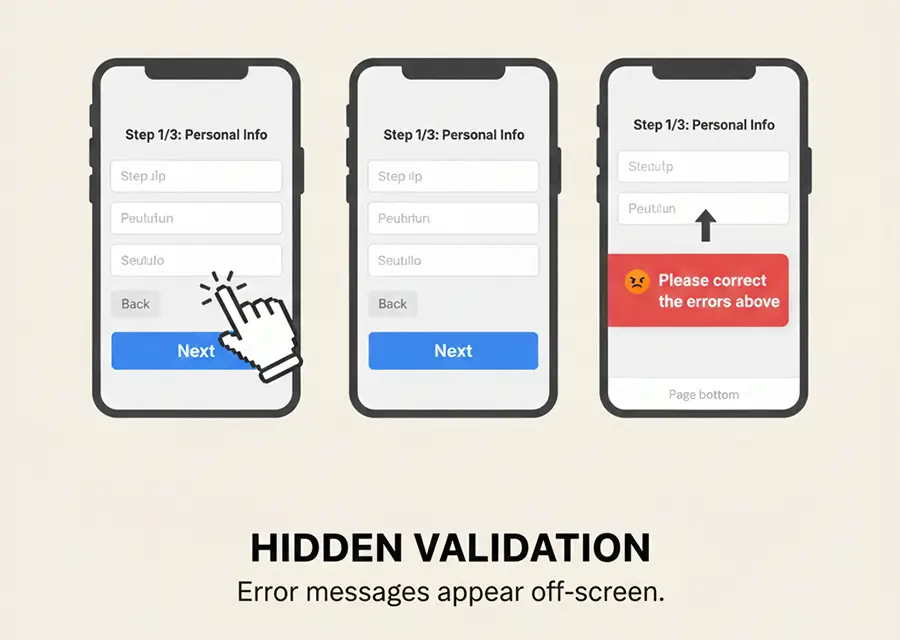
Scenario: A common mistake in multi-step forms is waiting to validate fields until the user clicks Next. Instead of checking each field as it’s filled out, the form holds off until the whole step is complete. Then, when the user clicks Next, validation kicks in—often without a clear error notification hint about which field caused the problem.
Root Cause: Users expect to move on when they click Next. Instead, they encounter a validation error and have no idea where the problem exists, which often leads them to click the Next button repeatedly in frustration.
Improvement: Validate fields in real time as the user fills them out, or, if validation happens after clicking Next, automatically focus on the problematic field and show a clear, visible error message.
Example 5: Overlapping Layers
Scenario: This one actually happened to us. In the first few days after launching Skippership, we noticed that on the Add Website page, the rate of website additions dropped by 35% in just 35 minutes. By reviewing session replays and analyzing the add-to-website funnel, we found that this drop-off mostly affected mobile users.
Root Cause: When users clicked the Add Website button, a pop-up for trial activation would cover the entire screen, preventing mobile users from actually adding their websites.
Improvement: We quickly worked with our developers to fix it, using z-index to set the proper display order for layers. This solved the problem and restored full functionality for mobile users.
How to Identify Rage Clicks
To figure out if a user’s behavior counts as a rage click, it helps to keep two things in mind:
- False Positives: When a user deliberately clicks an element or button a couple of times, it might look like a rage click, but it isn’t necessarily frustration-driven.
- False Negatives: When a user keeps scrolling or moving the mouse around in frustration, trying to find something they can’t reach. This kind of behavior can easily be missed if you’re only looking at clicks.
These two scenarios make spotting real rage clicks a bit tricky.
At scale, patterns have been developed that significantly reduce false positives. Detecting false negatives, though, usually means manually watching session replays.
What makes Skippership stand out is its AI-driven approach, which lets you avoid watching every single session. The AI analyzes user interaction data to tell whether someone’s actions were purposeful or aimless, helping website and app managers spot frustration without endless manual review.
Here are the main ways to detect and identify rage clicks:
Autocapture Technology
Tools like Skippership can automatically capture all user engagements without needing a single line of code. Rage clicks are then flagged based on preset patterns.
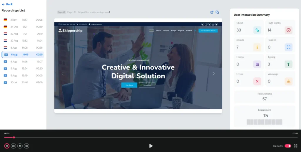
Session Replay Tool
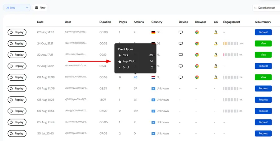
Session replays let you see how many rage clicks happened in each session and review them in detail.
When watching these videos, keep an eye out for:
- Rapid repeated clicks on an element: Clicking quickly over and over without any delay for response signals frustration.
- Tiny mouse movement area: The cursor barely moves, hovering in a small spot as if the user is furiously trying to click or tap something.
- Mouse down without mouse up: Clicking a button but not releasing it, keeping the cursor pressed on the element.
- Click followed by immediate scrolling: After getting no response, the user starts scrolling to find another way to achieve their goal.
- Erratic, angry mouse movements: The cursor zips around the page, showing impatience and frustration.
These patterns give clear signals of user frustration and make it easier to separate true rage clicks from normal interactions.
Heatmap Tool
We won’t dive too deep into heatmaps here, but you can check them out fully via the link provided. In short, as the image shows, heatmaps provide a visual snapshot of where users click most and least on a website. These “hot” and “cold” spots are strong signals of user behavior, though a hot spot doesn’t automatically mean there’s an error.
What Heatmap Tools Show:
- High-Density Click Clusters in Non-Clickable Regions: Red spots show where users click most. If an area has way more clicks than its surroundings but isn’t a meaningful element, it’s worth looking into.
- High clicks, low conversion: When a button or element receives a high volume of clicks but yields little or no conversion, that’s a red flag for potential issues.
- Click-to-user ratio: Check clicks against the number of users on the page:
- Normal: one or two clicks per element per user
- Needs review: six to twelve clicks per element per user
- Clicks on loaders or skeleton screens: Frequent clicks here might mean the loader isn’t working properly or the content isn’t loading as expected.
In short, the most effective way is to begin by reviewing session replays, then checking heatmaps, and comparing the results with funnel data. All these tools are built right into Skipership, making it much easier to spot problem areas and understand user behavior.
AI Signals for Rage Click Detection
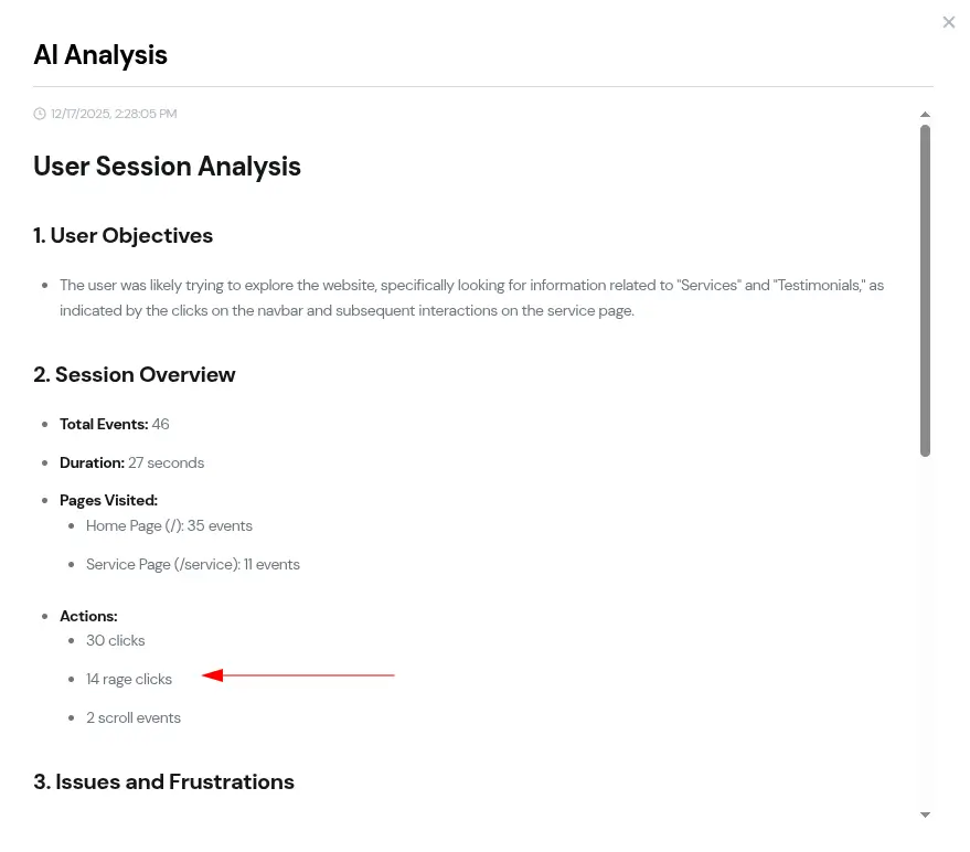
To detect rage clicks more accurately, user interaction data needs to be analyzed using AI. As shown in the image, Skipership already supports this. It doesn’t just highlight the areas where rage clicks happen; it also suggests practical actions you can take to address them. That alone makes the whole detection and fix process much faster.
These AI-generated summaries keep you from being swamped by false negatives or false positives. Instead of chasing noise, they push your focus toward the actual problem, so you can deal with what really matters and make decisions more quickly.
Rage Click Diagnosis Framework (RCD-F)
To make things easier, we’ve put together a simple, practical framework for identifying and resolving rage-click issues. In just a few steps, you can pull the right data, analyze it, and move into action. This approach is especially helpful for product managers, designers, and CRO specialists.
Step 1: Detect the Rage Click Event
The first step is simple: find the rage clicks. Head to your analytics dashboard, for example, in Skipership, and look through the list of session replays where rage click events have been detected.
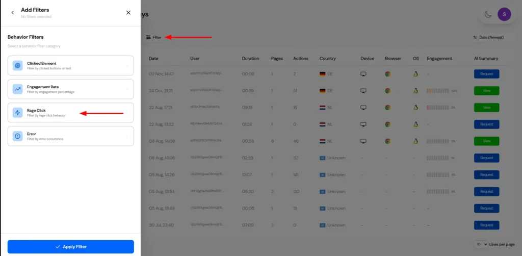
Step 2: Categorise the Rage Click
Next, use dashboard filters to narrow things down to session replays where at least one rage click clearly occurred. In Skipership, this is easy to do with built-in filters, so you only spend time reviewing sessions that actually matter.
Step 3: Map the Rage Click to the User Journey
Once you know where the rage click happened in the session replay, map it to the user journey. Group these sessions by landing path and exit path to see which flows consistently trigger rage-click behavior.
Step 4: Replay the Session and Analyse Behaviour
Now it’s time to watch and analyze the session replays.
Pay close attention to what users expected to happen on the page compared to what the design or functionality actually delivered. Do those expectations line up, or is there a clear gap?
At this stage, focus on:
- Identifying the main goal of the user in each user journey
- Listing the failure points or breakpoints where rage clicks occurred
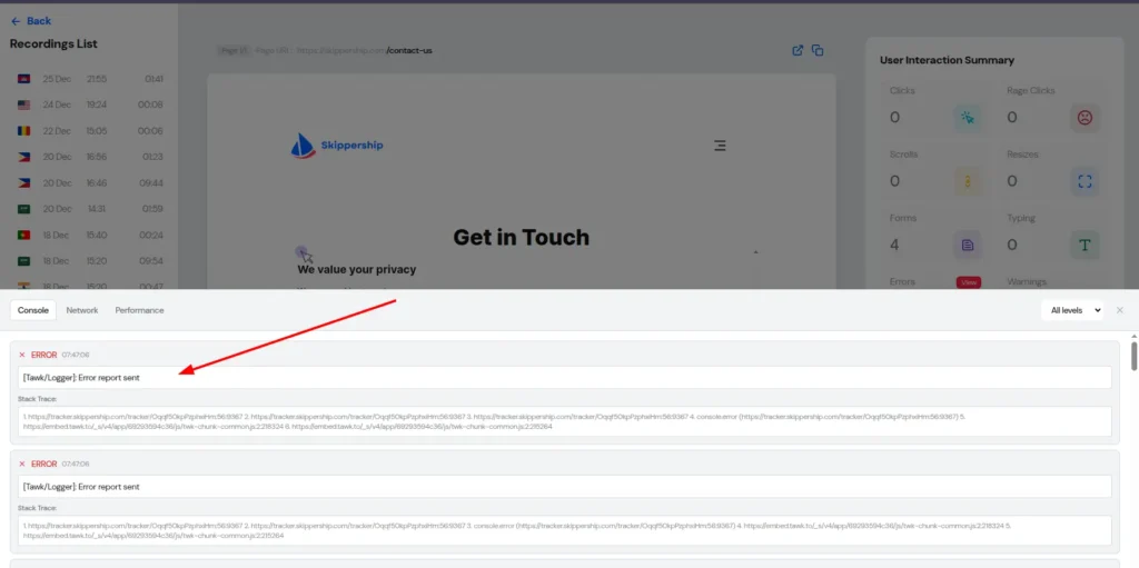
Step 5: Check Technical Root Causes
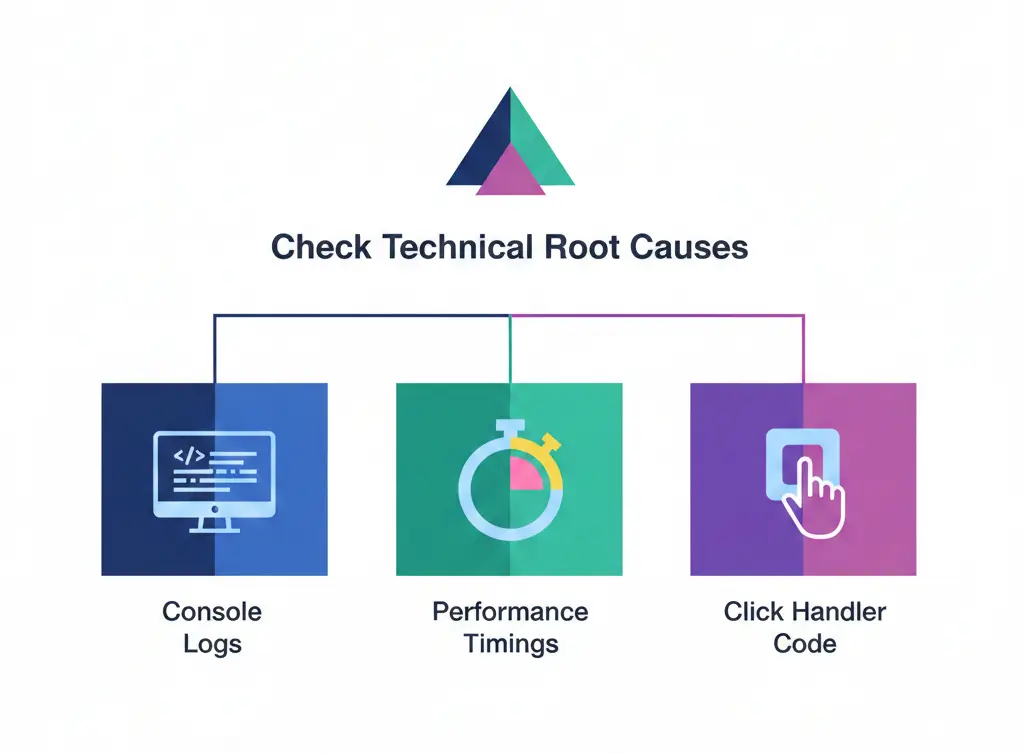
Using Skipership, extract any errors that appeared in the browser console at the exact moment the rage click happened, and pass those along to the technical team.
You should also:
- Measure how long the page took to load
- Test the click handlers tied to the expected action and capture any errors if something breaks
Step 6: Check the Design (Affordance Audit)
If the rage clicks seem to be UI-related and no technical errors are found, it’s time to take a closer look at the design. For now, focus on categorizing the issue. Identify how many users and how many sessions failed to reach their intended goal on that page or element.
Step 7: Fix, Check, and Launch
Based on what you’ve uncovered in the previous steps, start rewriting copy, redesigning components, or fixing technical problems. Once the issues are resolved, ship the updated version back to users as soon as possible.
Step 8: Prioritise by Impact
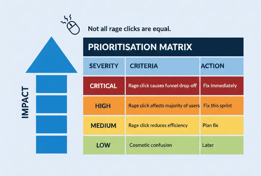
After completing the earlier steps, prioritize each rage-click issue based on its impact on the funnel and user drop-off. This helps you decide where to focus first and which metrics to re-measure.
Prioritisation Matrix
| Severity | Criteria | Action |
| Critical | Rage click causes funnel drop-off | Fix immediately |
| High | Rage click affects the majority of users | Fix this sprint |
| Medium | Rage click reduces efficiency | Plan fix |
| Low | Cosmetic confusion | Later |
Step 9: Continuous Monitoring Loop
From here on, monitoring should become part of your regular workflow. Review session replays tied to key landing paths and exit paths, and hold weekly review sessions to check whether your changes are actually improving conversion rates.
When Rage Clicks Are Not Problems
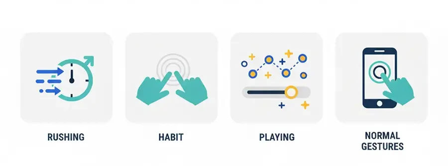
This is an important question to answer at the end of the process. When do clicks look like rage clicks, but really aren’t?
- Users are in a hurry: they may click rapidly simply because they’re rushing and haven’t yet received feedback.
- Habitual behavior: Some users double-click links by habit or muscle memory.
- Playful engagement: Others just like to explore and interact with UI elements in unexpected ways.
- Normal actions: On mobile, double-tapping to zoom is common and shouldn’t be counted as a rage click.
Conclusion
Rage clicks are a red-flag warning. They show that the user is highly confused and frustrated, and often just one step away from leaving the website or app completely.
They can lead to serious consequences, including:
- Lower conversion rates and overall revenue
- Weaker retention and long-term damage to user loyalty
- Damage to brand awareness and overall brand perception
- Higher support costs
By reviewing session replays, checking heatmaps, and comparing the results with funnel data, it becomes easier to spot problem areas and understand user behavior. AI-driven analysis helps reduce false positives and false negatives, allowing teams to focus on what really matters.
Once rage-click issues are identified, fixing technical problems, redesigning components, and shipping improvements as quickly as possible helps improve the user experience. Continuous monitoring should then become part of the regular workflow.
FAQ
A rage click happens when a user clicks an element on a website or app, and nothing happens, then repeats the same action 2 or 3 times in quick succession, usually within a short window of 100 to 2000 milliseconds.
When users feel confused or irritated, they naturally start clicking the same button over and over, almost without thinking.
Yes. You may see this behavior described under different names, such as rage clicks, frustration clicks, click rage, rage tapping, rapid clicks, or even angry clicks.
Users tend to feel mental tension when their time feels wasted, they are forced to wait longer than expected, or they fail to reach their intended goal. In these moments, users start repeatedly clicking the same element.
Rage clicks occur when an event executes slowly, fails to execute, or returns a response that does not match the user’s expectations. Simply put, the app or web page does not react in a way that feels responsive or helpful.
They show that the user is highly confused and frustrated, and often just one step away from leaving the website or app completely.
They can lead to lower conversion rates, weaker retention, damage to brand awareness, higher support costs, and long-term damage to user loyalty and overall brand perception.
A rage click involves multiple consecutive clicks on the same element, while a dead click is a single click or tap on an element that produces no reaction at all.
An error click triggers a JavaScript error in the browser console or visibly throws a technical error to the user, while rage clicks are driven by repeated failed attempts to get a response.
It is aimless mouse movement while trying to reach a goal but failing to find it, usually caused by poor navigation or flawed UI design.
Based on data analysis conducted at Skippership, 63% of users who experienced rage clicks abandoned the website or app.
When a response drags on without any visual feedback, users assume their first click didn’t register and start clicking again.
Through autocapture technology, session replays, heatmaps, and AI-driven interaction analysis.
AI analyzes user interaction data to determine whether actions were purposeful or aimless, reducing false positives and false negatives.
When users are in a hurry, act out of habit, engage playfully with the UI, or perform normal actions like double-tapping to zoom on mobile.