
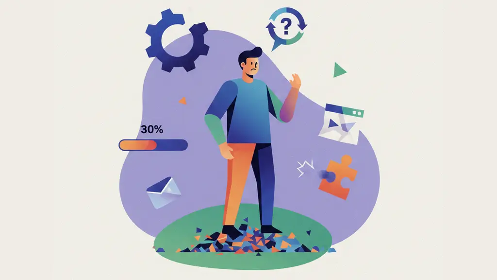
User drop off is a term that almost anyone working in online businesses has heard at some point. One of the biggest challenges for any digital product still comes down to a simple, nagging question: why do users drop off?
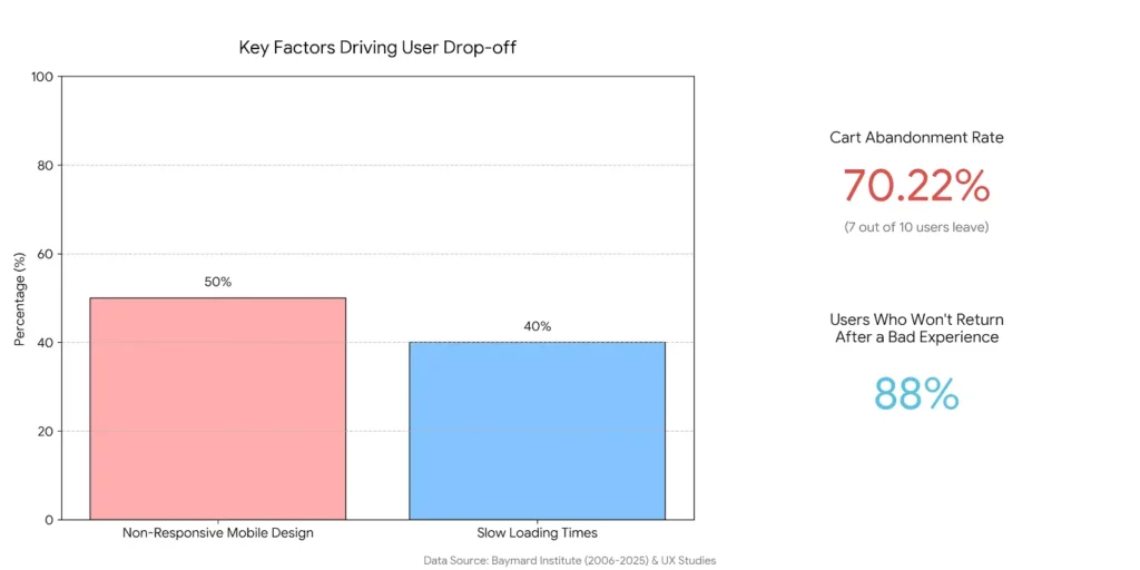
According to data from the Baymard Institute, between 2006 and 2025, an average of 70.22% of users left a website or app right at the start of the purchase journey, most often at the cart stage. Put simply, of every ten users who reach the shopping cart, seven leave before completing their order.
What’s even more troubling is what user drop off analysis shows over time. Across those 21 years, this number has barely moved. That tells us the problem hasn’t really improved, and many of the same issues are still showing up today.
When you break down the causes, bad user experience is the biggest driver of drop off. Studies show that 88% of users won’t return to a website after a bad experience. That experience is often shaped by slow loading times (reported by 40% of users), non-responsive mobile design (affecting around 50%), and navigation issues or content that simply doesn’t feel relevant.
This is Melina, and in the sections ahead, I want to dig deeper into user drop off analysis and the real reasons behind it. The goal is simple: clearly identify what’s driving users to leave your website and, ideally, fix those problems once and for all.
What Does User Drop Off Mean, and Why Should You Care?
User drop off refers to the moments in a journey when a user starts a multi-step process, like signing up, making a purchase, or going through onboarding, but leaves before finishing it. A few simple examples help make this clearer:
- A user on an e-commerce site adds products to their cart but leaves the checkout page.
- A user starts filling out a registration form, gets halfway through, and then drops off.
- A user signs up, enters the onboarding flow, and for one reason or another decides not to continue.
So why does user drop off actually matter?
At first, it might seem like it is only about lost revenue or missed sales. In reality, it goes much deeper than that. When these red flags appear, they can hurt your brand and reputation, slow growth, and seriously weaken user loyalty.
Spotting drop off points helps you uncover bottlenecks and improve the overall experience. That, in turn, makes it easier to strengthen your funnel and increase conversion rates without falling behind the competition.
At the same time, every drop off should cause you to stop and think and ask a few important questions:
- Are you really delivering a solid UI and UX?
- Are there technical issues you might not even be aware of?
- Is navigation working the way users expect when they land on a page?
- Are you meeting user needs at the right moment?
These are exactly the questions we will dig into next.
Drop off vs Bounce vs Churn: Key Differences
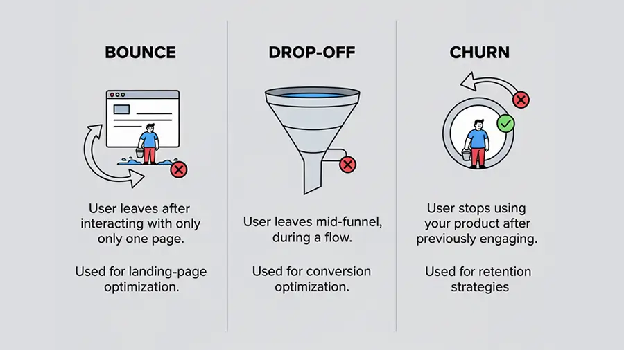
Understanding the differences between drop off, Bounce, and churn is important. Using them incorrectly can lead you to track the wrong metrics and take the wrong actions.
- Bounce: A user lands on a page and leaves without interacting; no scrolling, no clicking. e.g, someone visits a registration landing page and exits immediately without doing anything.
- Drop Off: A user starts interacting with the page but abandons it before completing their goal. They take some steps but don’t finish the final action. e.g, a user adds items to their cart, browses a few more products, but leaves the checkout page before completing the purchase.
- Churn: This is when a previously active user or customer stops using the product altogether. Unlike bounce or drop off, churn is about long-term engagement, like a monthly or yearly subscription that gets canceled and isn’t renewed. e.g, a subscriber cancels an annual plan and doesn’t come back.
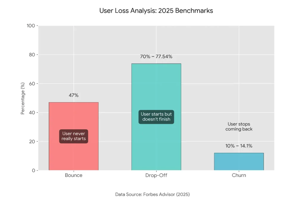
| Type | Description | Average Rate (Forbes Advisor, 2025) |
| Bounce | User never really starts | 47% |
| Drop Off | User starts but doesn’t finish | 70–77.54% |
| Churn | User completed actions before but stops coming back | 10–14.10% |
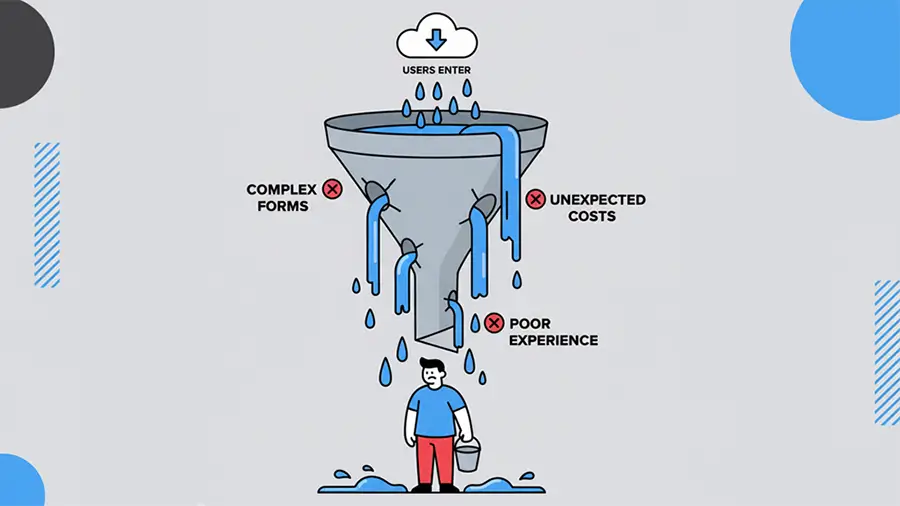
Why Users Drop Off: Common Causes of User Drop-offs
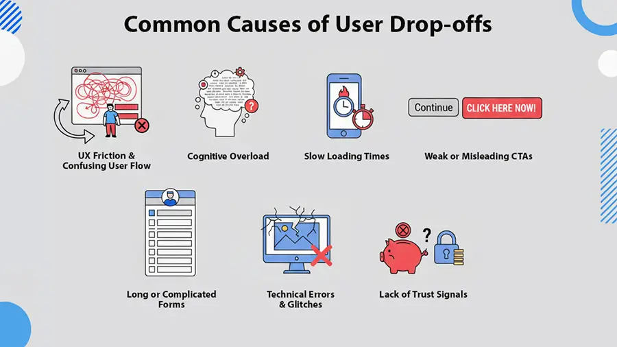
The biggest question for any digital business is: why do users suddenly leave a page? There are seven common reasons this surprising drop off happens. Here are the main ones:
1. UX Friction & Poor User Path UI/UX
With AI agents now able to respond to user questions in a fraction of a second, a complicated design or confusing UX is almost certain to fail. Users are always looking for simple, hassle-free ways to get things done.
- Some UX mistakes:
- Lack of helpful guides or tooltipsays.
- CTAs that are hard to spot
- Missing or poorly designed loaders and spinners
- Converting simple forms into annoying multi-step forms
- Confusing navigation
2. Slow Loading Times
It’s 2026, and let’s be honest—no one views a slow website or slow reaction. They want to read, watch, or interact immediately. If your site or app drags, they’ll close it almost instantly.
3. Overwhelming Information
AI agents again show us how fast users can get answers today. So, if your site or product page dumps too much information, it can be confusing and frustrating. Avoid long, unnecessary content, overly complicated forms, or asking users for too much at once.
4. Weak, Hidden, or Vague CTAs
IEven though this overlaps with UI/UX, it’s important enough to highlight separately. Look at these stats:
- 60% of user drop-offs on home page happen because users can’t find the “Learn More” button.
- 25% of drop-offs during onboarding happen because the final CTA is hard to spot, often triggering rage clicks.
- 15–30% of abandoned shopping carts occur when there are no clear CTAs for adding more products or navigating comparison pages.
It’s clear that the placement and visibility of CTAs, buttons, and links play a huge role in keeping users engaged.
5. Long, Complicated Forms
Forms are an essential part of websites and apps—they collect useful user info for your business. But when forms are too long or overly complicated, users get frustrated and drop off. Higher drop off usually happens when forms:
- Become long, multi-step forms without a skip option
- Ask for information you don’t really need
- Require a phone number when it isn’t essential (users are sensitive about this)
- Include extra fields instead of keeping it simple with one or two relevant fields
6. Technical Glitches and Bugs
Technical issues and software bugs can push users straight out the door, and these drop off are especially frustrating. Examples include:
- Clicking a button that does nothing
- Showing scary server errors that undermine trust (users feel like the site might be hacked)
- Validation errors with no clear indication of which field is wrong
- Non-responsive design that doesn’t work well on mobile
7. Lack of Trust or Confidence
Some pages need to build trust with users through trust signals. When these are missing, drop off becomes more likely.
- Displaying secure payment gateway logos on checkout pages
- Offering money-back guarantees if users aren’t satisfied
- Showing social proof, testimonials, or videos from past users
- Avoiding surprise fees on the checkout page before payment
How to Identify Drop Off Points
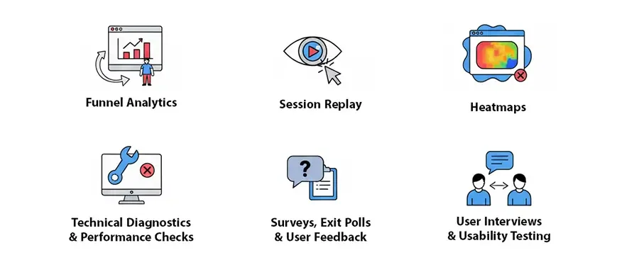
Now that we’ve covered the theory, let’s get to the practical part: identifying exactly where users drop off on your site or app.
Step 1: Funnel Analysis (GA4, Skippership)
The first step is to set up analytics tools at the paths where drop off occur. You are familiar with Google Analytics (GA4), but navigating funnels there can be tricky. That’s why I recommend using Skippership. With Skippership, you can set up your funnel in under a minute and start analyzing data immediately.
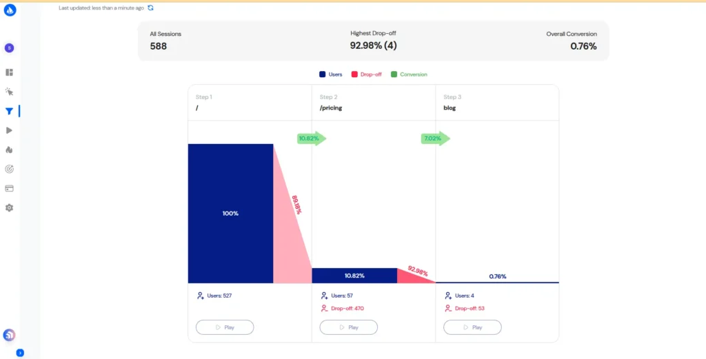
When reviewing your funnel, the key metrics to focus on are:
- Completion rate at each stage
- Percentage of users moving to the next step
- Pages or steps where users exit
- Time spent by users at each stage
These metrics give a clear view of where users are getting stuck or leaving, allowing you to target problem areas with data-driven solutions.
Step 2: Session Replay to Observe Behavior
Session recordings tool let you see how users interact with your website. You can watch what they do on landing pages and get a sense of what they expect from each page. As shown in the image above, clicking the Play button at any step of the funnel lets you watch a collection of user session replays. From there, you can start your initial analysis by paying attention to these behaviors:
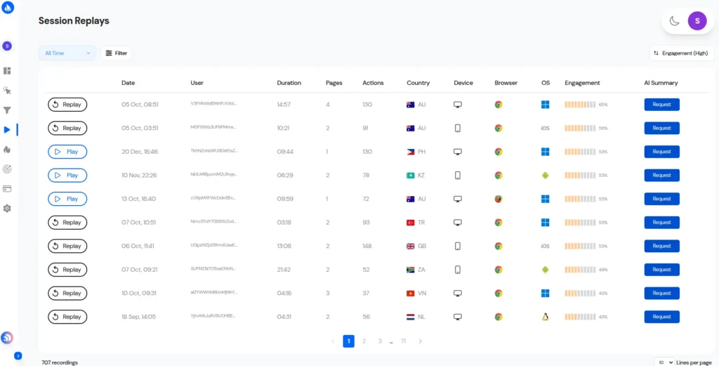
While you are going through these replays, these are the signs of trouble you should be looking for:
- Rage clicks: These happen when a page or CTA isn’t working as expected. Frustrated users repeat the same action multiple times in a short span of time.
- Dead clicks: Users click on elements, images, or areas they think are clickable, but they aren’t.
- Frustration loops: Users move their mouse, scroll up and down repeatedly, or switch between pages without a clear purpose.
- Abandoned forms: Users start filling out a form but give up, leaving it incomplete.
Skippership also tracks inactive periods, so when you’re reviewing session videos, you can skip the inactive parts and make your analysis more efficient.
On top of that, Skippership’s AI helps you understand what happened and even recommends actions to fix all without having to watch every single video. This saves time while giving you clear, actionable insights to improve the user experience.
Step 3: Heatmaps for Attention & Engagement
The heatmap tool lets you visually see which parts of your website or app are grabbing users’ attention. But they’re not limited to spotting what’s popular. Sometimes users focus on an area not because they like it, but because there’s a problem that’s causing them to drop off.
For example, you might design a CTA and put it in a feature area, expecting lots of clicks. But when you check the heatmap, it gets no attention and appears blue. That’s a signal to pause and figure out why it’s not working.
Step 4: Technical Bugs and Performance Checks
Not all user drop-offs are caused by UI/UX issues. Sometimes, the problem is technical bugs that developers unintentionally introduce. Luckily, there are tools that make spotting these issues much easier.
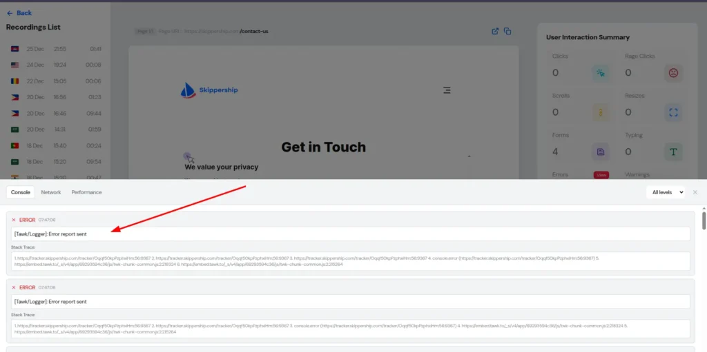
For instance, in Skippership, you can filter session replays to focus on ones with console errors or warnings and see exactly how users encounter these issues. You can also view the specific errors users ran into while interacting with your site.
Doing this allows you to:
- Spot broken scripts and figure out what caused them
- Keep coding errors from showing up to users
- Fix problems that only appear on certain devices, like mobiles or tablets
Step 5: Surveys, Interviews, and User Feedback
The next step in figuring out why users drop off is to talk to them or collect feedback directly. When users visit your site, it can be really helpful to reach out through live chat or feedback tools and ask what frustrates them or might make them leave your website or app.
To get ahead of potential drop off, you can also pick some of your current loyal customers and hold short interviews with them. Ask for honest feedback about which parts of your product or site feel annoying or could use improvement.
Here’s a real example from Skippership:
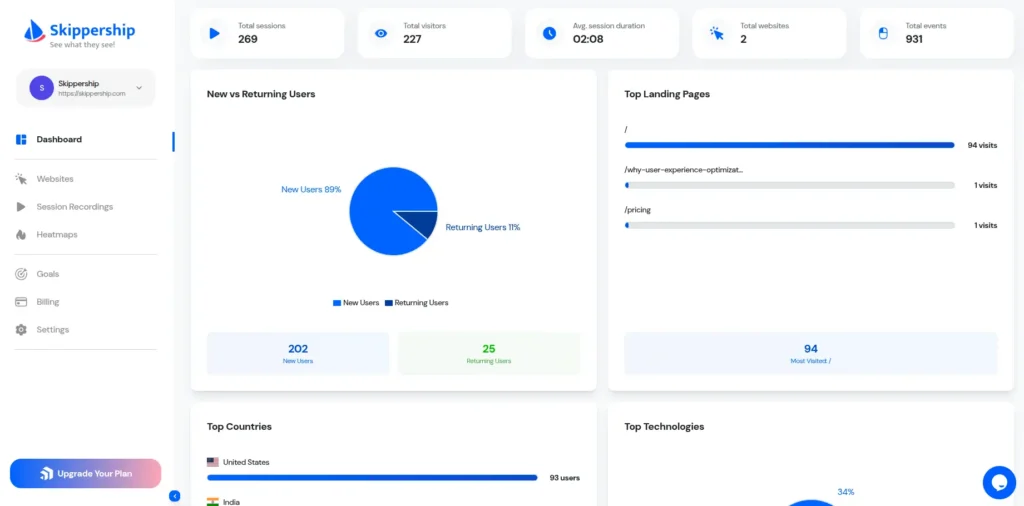
We recently ran random interviews with both our most active and least active customers. From these sessions, we learned that users really wanted a dashboard that let them quickly see key metrics: return vs. new users, user counts by country, device types, landing page visits, and exits.
Before this, we hadn’t thought of building such a dashboard. After rolling it out, our loyal customer base grew by 2.71x.
AI-Powered Drop Off Detection
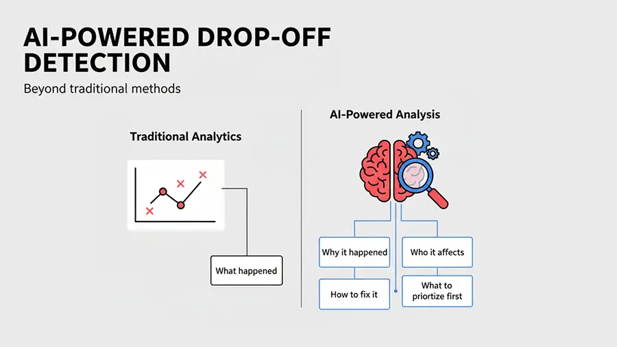
We are in the era of AI, so it makes sense to let it handle repetitive tasks and free up our time for more important work. When it comes to spotting drop off, you can let AI handle some tasks and then interpret the results yourself. Think of it as a supervisor that helps guide your decisions rather than making them for you.
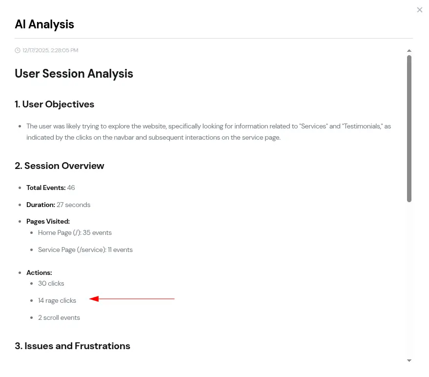
In Skipership, the AI tool identifies user drop off points by summarizing session replay videos and analyzing heatmaps. Once it spots these areas, it suggests actions—called Insight Actions—that help you make improvements faster.
For example, the image below highlights a part of a page where a drop off happened due to rage clicks, as detected by the AI tool
Step-by-Step Framework to Reduce Drop-offs
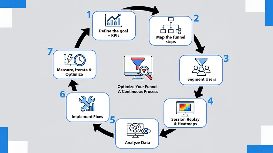
Step-by-Step Framework to Reduce Drop Off
To help you stay organized and act on your insights, we’ve created a framework for reducing drop off.
Every time you use it, you can check the factors behind drop off and quickly figure out solutions.
1. Define Your Goal and Key Metrics
You can’t fix drop off without first knowing what you’re measuring. Start by mapping your goals on paper. Identify the key areas of your website or app that, if they fail, might interfere with the whole experience. Examples include:
- Registration page
- Onboarding page
- Add-to-cart page
- Checkout page
Next, set clear metrics. Metrics give you a concrete goal to track progress. For example, you might aim for 50 registrations per day on your sign-up page and try to increase that to 65 after making updates. Track this over a week/month to see your results.
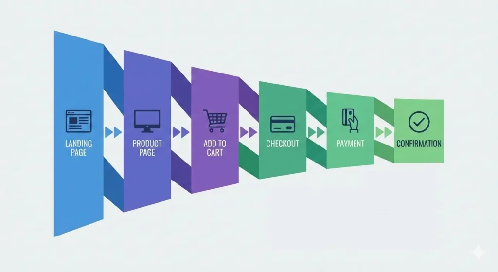
2. Map Out Every Funnel Step
For each goal and metric, lay out the corresponding funnel. Examples include:
E-commerce product purchase funnel:
Landing Page → Product Page → Add to Cart → Checkout → Payment → Confirmation
SaaS subscription funnel:
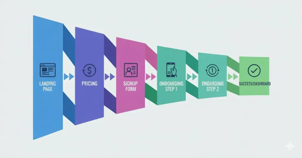
Landing Page → Pricing → Signup Form → Onboarding Steps 1, 2, 3 → Success/Dashboard
3. Segment Users to Reveal the Real Story
Once you have funnel data, segment users to detect trends. Effective segmentation could be:
- New vs. returning users: Is this their first visit?
- Mobile vs. desktop: What device are they using?
- Organic vs. paid traffic: Did they come through search or paid campaigns?
- High-intent vs. low-intent users: Are they actively looking to buy, or just browsing?
This kind of segmentation gives you insight into which user groups to focus on first.
4. Use Session Replays and Heatmaps at High-Risk Steps
Once you have your segments, look into why users are having issues or dropping off. Session replays and heatmaps are usually the best ways to spot these problems.
5. Dig into the “What,” the “Why,” and AI Insights
After identifying drop off points, ask:
- Where exactly are users hitting problems?
- Where are they getting confused? Look for signals like no mouse movement, long inactivity, rage clicks, or rage taps.
- Which elements are causing the most errors?
- Which devices are running into these issues?
Answering these questions helps you plan your next steps more accurately. Skippership’s AI tools can automatically provide this information, saving you time and improving accuracy.
6. Implement High-Impact Fixes
Once you know what’s broken, take action. Some examples:
- Shorten long forms
- Move or adjust CTAs
- Add trust badges to key pages
- Speed up pages by compressing images and CSS/JS files
- Use real-time validation in form
7. Measure, Tweak, and Keep Optimizing
Finally, check all your metrics again. On a weekly or monthly basis, ask:
- Has the conversion rate improved?
- Has the time to complete funnel steps decreased?
- Has the drop off rate gone down?
If everything looks better, that’s great. If even one metric hasn’t improved, repeat this seven-step cycle until you reach your goals.
A Real Example: Boosting User Sign-Ups by 40%
One SaaS startup in the LinkedIn marketing space offers an automation tool for people who want to be more active on LinkedIn. Recently, they shared their data with us and showed how funnel analysis and pain point discovery helped boost sign-ups by over 40%.
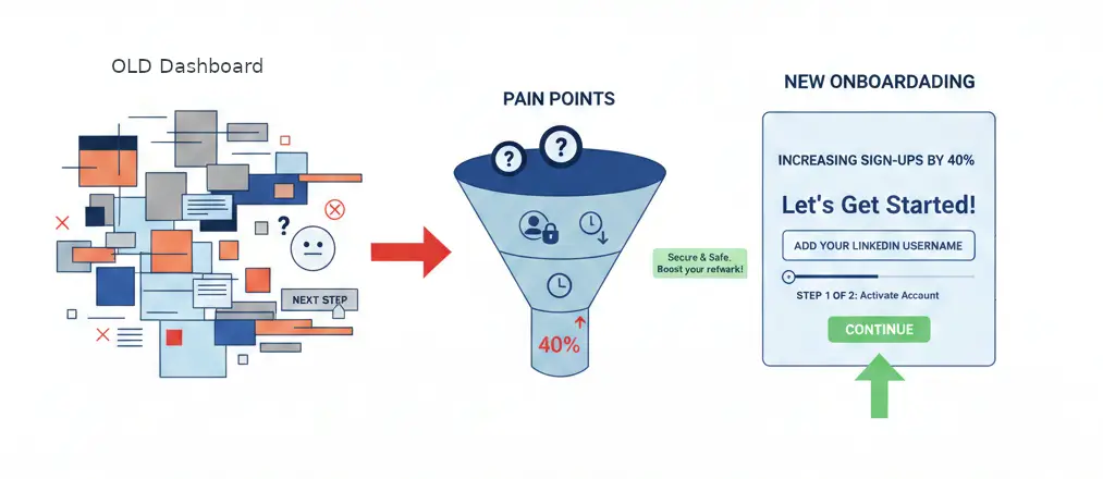
Early on, the team noticed a group of users getting stuck on the dashboard for more than two minutes after signing up. These users never moved on to the next step, adding their LinkedIn username. Something wasn’t working.
When the team investigated user behavior further, they realized this wasn’t simply a technical issue. It was more of a mental and behavioral one.
After signing up, users landed on a dashboard packed with information, charts, and messages. Instead of being guided toward the key action, their attention was scattered. The most important step, adding a LinkedIn username, ended up getting lost in the noise.
Through user interviews and session replay reviews, three main pain points surfaced.
First, users weren’t sure what to do next. The dashboard looked like a fully active product, even though no data had been added yet.
Second, adding a LinkedIn username felt risky to some users. They worried about account security and possible bans, but there was no description or tooltips.
Third, the timing was off. Users hadn’t yet seen enough value to feel comfortable connecting their LinkedIn accounts.
With these conclusions, the team decided to redesign the onboarding funnel.
For new users, the dashboard was simplified to a box with one clear message: to get started, add your LinkedIn username. Everything else was hidden until that step was done.
They also added a short explanation following the username field explaining why it was needed, what data would be collected, and how account security was handled. Also, they showed a small preview of the outcome before users took action.
Finally, a simple progress indicator was added to show users they were just one step away from fully activating their account.
The results were hard to ignore. Completion rates for this step jumped by more than 40%, and overall activation time decreased significantly. The team came away with a clear takeaway: funnels aren’t just about steps. They’re about reducing mental friction and steering users toward one critical action at exactly the right time.
Conclusion
User drop off remains one of the biggest challenges for digital products. The data is precise: most users leave before completing key actions, and this behavior hasn’t shifted much over time. In many cases, the reasons are familiar ones. Poor user experience, slow performance, unclear CTAs, long forms, technical issues, and a lack of trust tend to recur across onboarding flows and checkout pages.
By using funnel analysis, session replays, heatmaps, technical checks, and direct user feedback, teams can gain a much clearer picture of where users drop off and what pushes them away.
FAQ
User drop off happens when someone starts a multi-step process, like signing up, making a purchase, or going through onboarding, but leaves before finishing it.
A bounce is when a user lands on a page and leaves without doing anything at all. Drop off is different. The user does interact, but stops before completing the final action.
Drop off happens within a specific flow or process. Churn, on the other hand, refers to users who were active in the past but eventually stopped using the product and don’t come back.
Because it goes beyond lost revenue. High drop off can hurt your brand, slow down growth, and weaken long-term user loyalty.
Poor user experience is usually the biggest factor. This often includes slow loading times, weak mobile design, or confusing navigation.
Things like hidden CTAs, long or excessively complicated forms, unclear navigation, and missing directions or tooltips often push users to leave.
Users expect pages to load and respond fast. When a website or app feels slow, many users leave almost right away.
By combining funnel analysis, session replays, heatmaps, technical checks, and direct user feedback.
AI can analyze session replays and heatmaps, highlight where drop off happen, and advise changes to fix them. This saves time and helps teams make more accurate decisions.
Great insights on friction points in the user journey! The focus on simplifying the experience is spot-on. I think many businesses underestimate how small obstacles, like a complicated registration process, can lead to significant user abandonment.